Pictograms seem hard. Coming up with an image whose meaning is immediately and clearly obvious to most people is probably impossible.
There’s no surprise that there’s a long list of commonly-accepted icons that are just not great:
The “save” floppy. This one made some sense for a brief period of history, so here it is forever, I guess.

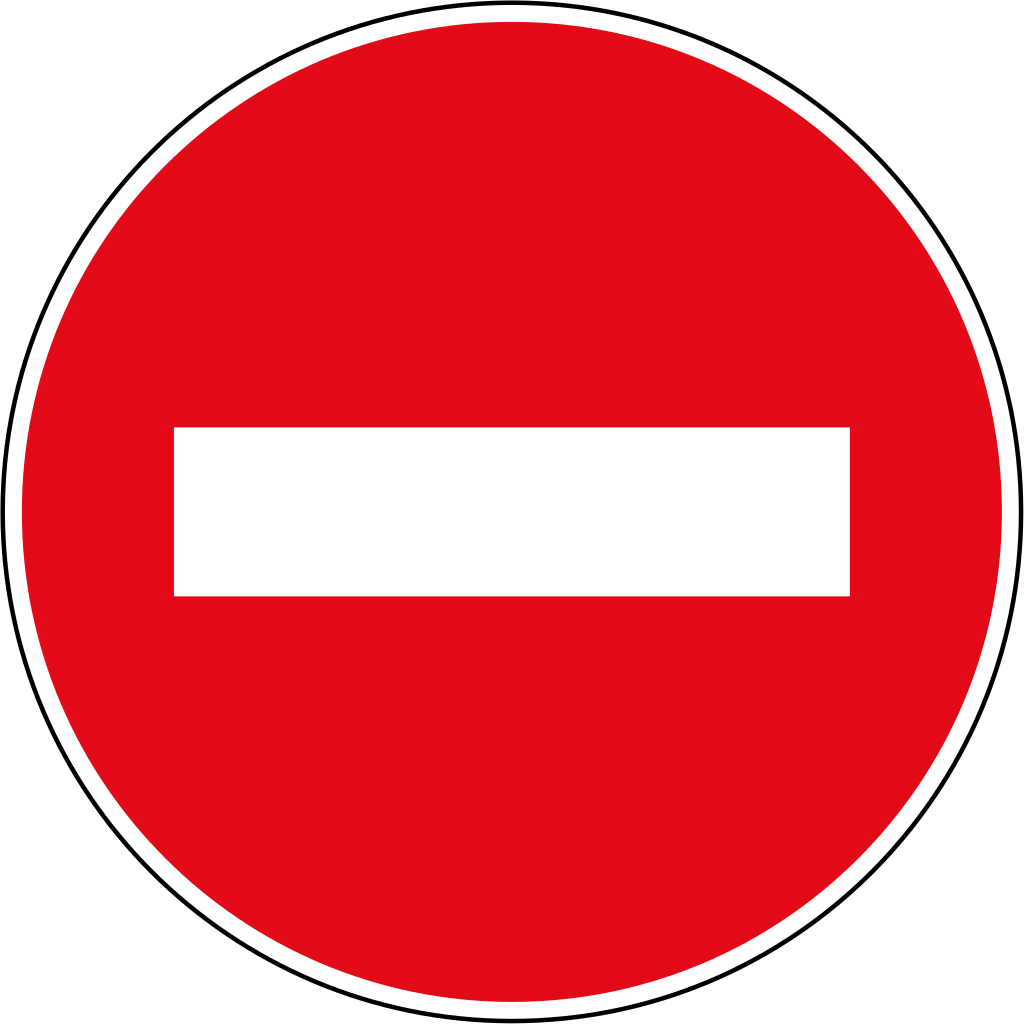
The ‘do not enter’ road sign. I don’t know about you, but a white brick has no inherent meaning to me.
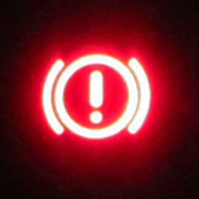
The emergency/parking brake icon in your car. This one tells me something is happening, probably, and it’s a huge problem!
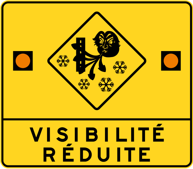
So, given how expansive the hall of shame of Bad Icons is, it’s good to celebrate the rare wins when you see them.
Let’s give a hand to whoever designed the ridiculously amazing road sign for wind/inclement weather on Quebec highways. There’s no question about what THIS work of art is telling me as I speed by at 100 km per hour: